


Veron Ennis
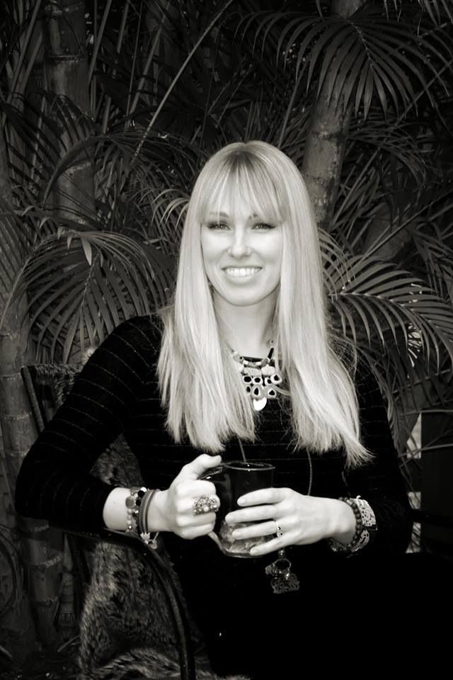 Name: Veron Ennis
Genre: Abstract
Gallery: HW Gallery, Naples and Von Fraunberg Art Gallery, Dusseldorf, Germany
Website: http://www.veronennis.com
Facebook:
Her Art:
 Veron Ennis is a Fort Myers-based modernist painter concerned with the intimate characteristics of the layered painted medium, the language of color, and the interplay between precision and chance application. Using an underlying grid format, she utilizes an assortment of media to create her paintings, including water-based paints, acrylics, polymer-based grounds, cotton rag paper, raw canvas and wood panel. “I discovered early on that oils are not my medium. “The cost, drying times and fumes interfere with what I want to do,” Ennis relates. But acrylics solve all of her technical questions and empower her to express herself within the confines of her self-imposed creative time constraints.
Her work can be divided into three series, Paper Milk, Chroma Tone and Transference.
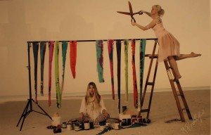
Paper Milk Series
 “In the early stages of my career, I was in search of an identifiable, consistent style,” Ennis relates. “I had to go through different approaches to find out what I was looking for, but I arrived there three years ago.” Paper Milk was Ennis’ jumping off point. The series was white, clean, and fresh, presented on free-hanging paper suspended from above by white string attached to the upper corners of each artwork by miniature white clothespins. Although well-received, Ennis has no immediate plans to return to the series given the limitations it imposes in terms of theme, content and the difficulties in pulling paint across such a fragile support as paper. [Depicted above is Kingdom from the Paper Milk series.]
Chroma Tone Series
 Following Paper Milk, Ennis embarked upon a bold, experimental body of work called Chroma Tone. “Chroma– the intensity of a distinctive hue, and Tone– the quality or character of a sound considered with reference to a source, are the blanketing concerns of this series,” explained Ennis in September of 2011. “The meticulously formulated palette in this series synchs with the carefully chosen typography to create a particular tone for each painting. The work creates a phonetic sound when viewed and ‘read,’ which echoes in the mind while the image is interpreted, leaving the impression of not only image- created by color and form, but also sound created by text.” [Depicted above is Scaffold from the Chroma Tone series.]
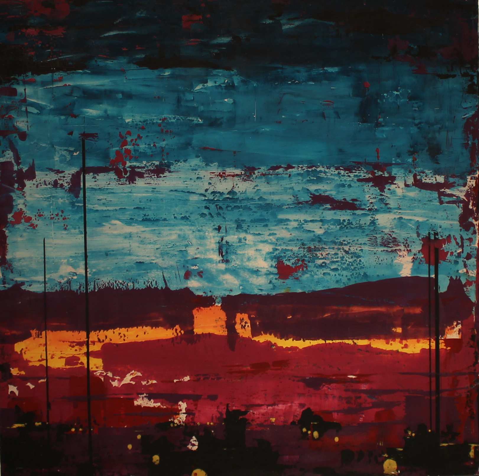
Transference
![]() Ennis calls her current body of work Transference. In these new tightly-structured abstracts, Ennis strives to transfer to her viewers elated feelings of love and joy in a non-objective manner. “The transference of information during the creative process from artist to painting, and then from painting to viewer when the work is completed, is the reason why art can transcend time and why abstract painting has the ability to communicate.
Ennis calls her current body of work Transference. In these new tightly-structured abstracts, Ennis strives to transfer to her viewers elated feelings of love and joy in a non-objective manner. “The transference of information during the creative process from artist to painting, and then from painting to viewer when the work is completed, is the reason why art can transcend time and why abstract painting has the ability to communicate.  Transferring specifically positive information through the means of creating a non-objective painting is a graceful way to connect with people and is freeing and enlightening for the artist. Transference is a series of work, continued from the series Chroma Tone, that conveys a gentle and calm message, created through the artist and medium, and open to a relaxed and perceptive interpretation. Positive artwork is no less serious than work of any other nature, in fact, it is essential,” Ennis explains.
 From a theoretical perspective, Transference operates from the premise that art has a measurable effect on people. Regrettably, that impact has been largely negative for too many years. “For decades, the art market has been saturated with works that portray negative positions on life and the world around us,” Veron writes in the December 2012 edition of Gulfshore Life. “Intriguing and arresting as they are, the sheer volume of such pieces compels me to ask, ‘How much
  negativity can the art world handle?'” Ennis believes that art lovers have reached their saturation point, coming to the sudden realization that they need to prevent dark, dreary and dreadful imagery from penetrating their home and office spaces and, derivatively, their psyches and souls. Believing that the feelings she conveys in her abstract compositions are transferred to the people who view her work, Ennis feels it is incumbent upon her to strictly regulate the emotions she experiences leading up to and during the creative process. “I won’t paint while I’m mad, sad or tired because that could be transferred to the viewer.”
 “A new movement is on the rise and will answer the call of the counter-culture,” Ennis postulates in the Gulfshore Life piece. “In styles from completely abstract to figurative realism, artists are embracing aesthetic beauty and spiritual expressions.” This doesn’t mean sweet, sentimental, shallow pieces that cater to unthinking enthusiasts spouting Coue’-inspired mantras and aphorisms. “We are talking about art that conveys beauty, truth or goodness,” insists Maureen Watson, owner of Watson-MacRae Gallery on Sanibel. “This is what humans always search for and what I search for all over the country. Technical proficiency is a given. This work goes beyond the technical into the spiritual, the metaphysical.”
![]() For her part, Ennis is all about conveying her own copious positive energy in order to heal viewers physically and psychologically. “I want to bring people to a peaceful place, a place in which they can find balance, a good place where although bad things may happen, people and the world are inherently good.”
For her part, Ennis is all about conveying her own copious positive energy in order to heal viewers physically and psychologically. “I want to bring people to a peaceful place, a place in which they can find balance, a good place where although bad things may happen, people and the world are inherently good.”
 While her new artistic approach requires her to exercise vigilance over her emotional state, Veron willingly yields large segments of the creative process to serendipity, happenstance and pure chance. It’s a technique called aleatoricism, and it acknowledges and embraces the role of fate, the laws of physics and the continuum of perpetual chaos in the creation of works of art. By collaborating with the forces that govern the universe, aleatoric artists like Ennis find they are able to transcend the limitations of the mind and body to reach previously unattainable artistic plateaus.
 The interchange begins with Ennis choosing the amount of paint, palette and areas to mask at the start of her composition. “Carefully pre-mixing each color in large containers, I find the precise tone of each hue that will communicate a feeling of comfort and well-being before ever starting a series of work.” But then fate intervenes as she pulls the paint across the un-taped surface to create “a delightful depth accented by drawn line.” The large sections of paint determine the landscape of the composition; the landscape, in turn, determines the detail, whether prominent or barely there. “Each time I apply a layer of paint, I stand back and evaluate the painting to see if it’s done.” If not, she applies and pulls another thin layer, yielding again to that higher, universal force in the creative process.
 This back and forth, alternatively yielding and then seizing control, is highly meditative, forcing Ennis to be and stay in the moment. “It requires me to focus intently. Every decision, every application matters intensely” as she engages in a dialogue with the canvas, discovering the painting in its making. “When the painting feels in complete balance, I know it’s finished.” This can occur in a single session or, more commonly, over a period of days, weeks or even months.
 One component that did not transfer over from Chroma Tone to Transference is text. Ennis wove numerals and letters into her Chroma Tone compositions as a means toward exploring form, sound, and meaning. “But over time I became aware that the text misdirected viewers into asking what the painting signified rather than how it made them feel. ‘How does this make me feel?’ is always the operative inquiry when it comes to abstract art.”
 “For 2,000 years, the world has been predominantly masculine,” Veron asserts. “But we’re going through a phase shift to the feminine perspective, which will be characterized by healing, spirituality and enlightenment.” Positive transference and aleatoricism are earmarks of this new perspective, and Veron Ennis is planted firmly at the forefront of these new artistic movements. Transference, therefore, is not just a new, transitory series, but the advent of a lifelong artistic pursuit with masterwork ramifications.
Education and Background:

Veron with son Liam at Chroma Tone opening at Fort Myers’ daas Gallery in 2011.
Growing up in northern Virginia, Veron Ennis was blessed with the opportunity to frequent the museums in the nation’s capital, which allowed her to develop her own artistic vision and voice at an early age. She attended Virginia Tech University, where she studied graphic design and art history. “I wanted to take painting classes, but they were reserved for painting majors,” Ennis recalls. “So I loaded up on art history classes.” That background provides context for her art and a solid foundation for her technique. More importantly, it “taught me how to learn, how to continue to educate myself and develop and grow.”
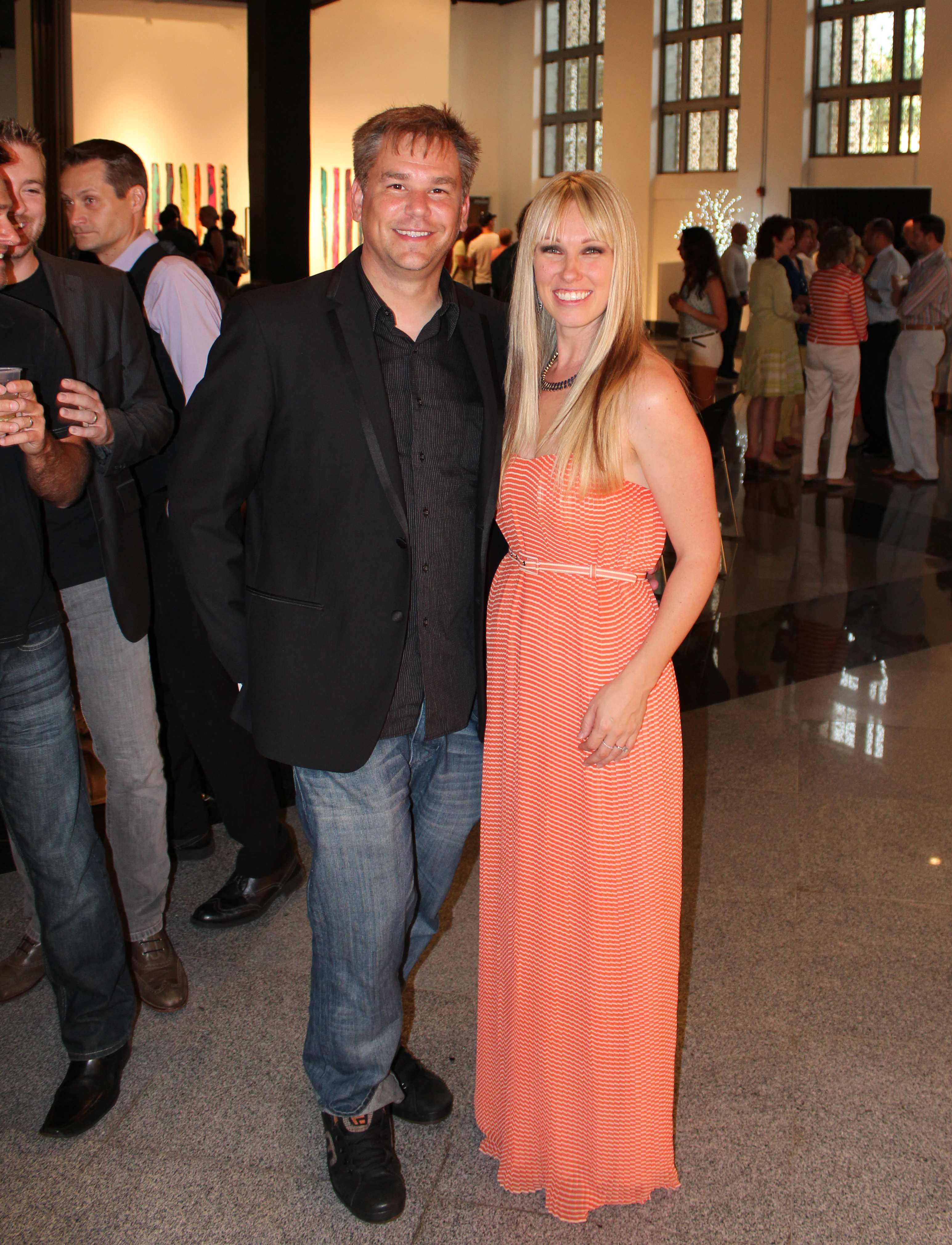
 Veron works from an in-home studio that provides the artist with bountiful sunlight and a commanding view of both Fort Myers and the Caloosahatchee River. Outfitted with brushes, archival pens, charcoal, rags, trowels, knives, drills, rulers, squares, buckets full of jar lids, scrap canisters, odd metal shapes, various widths of tape, razors, a hand sander and other tools of her trade, it’s an ideal venue for crafting uplifting non-objective paintings designed to make a positive, uplifting impact on the people who view them, including husband Duncan and son Liam. Both her studio and the rest of her home contain the beginnings of her personal art collection. While there are samples of her own art from the Paper Milk and Chroma Tone series, Ennis and husband Duncan support local artists and have amassed a modestly-sized collection of local work.
Exhibitions
") Veron has exhibited her works at some of Southwest Florida’s top galleries, including solo and group shows in Fort Myers, Sanibel, Naples, and Cape Coral. Her work has also been featured in Miami, as well as at New York’s Lyrical Luminosci-T and Amsterdam Whitney International Fine Art Gallery at a show curated by Ruthie Tucker.
Veron has exhibited her works at some of Southwest Florida’s top galleries, including solo and group shows in Fort Myers, Sanibel, Naples, and Cape Coral. Her work has also been featured in Miami, as well as at New York’s Lyrical Luminosci-T and Amsterdam Whitney International Fine Art Gallery at a show curated by Ruthie Tucker.
Her exhibition schedule for 2013 includes:
- INCOGNITO at Friends of Art, Naples Museum of Art, Curated by Richard L. Tooke, Naples, FL (January 31);
- OPT – Exhibition!, Mercato Pop-up Gallery, Saturday Nights Alive, Naples, FL (February 9, 6-10 p.m.);
") Veron Ennis: Solo Show, HOWL Gallery, Downtown Fort Myers, FL, Curated by Andy Howl (March 1, 6-10 p.m.);
Veron Ennis: Solo Show, HOWL Gallery, Downtown Fort Myers, FL, Curated by Andy Howl (March 1, 6-10 p.m.);- FLOR500 Native Wildflower Art Exhibition (part of Florida’s quincentennial celebration), Collier County South Regional Library in Naples; and
- Veron Ennis : Transference, Solo Show, Sydney and Berne Davis Art Center, Downtown Fort Myers, FL (August 2 -22, 2013.
- During the month of August, Ennis will be hosting “Transference in Art,” a lecture forum which will include a private walking tour of the exhibition, an introduction to the OPT Art Movement, and a guided discussion on interpreting art and the personal effects art has on the viewer.
")
Curatorial and Art Journalism Backgrounds

Ennis with Marcus Jansen in front of “Imminent Threat” at UNIT A.
Ennis is the former Director of UNIT A Contemporary Art Space, a 7,000 square foot urban loft space exhibiting and housing the permanent collection of internationally acclaimed urban expressionist, Marcus Jansen. She served as the global expert on his work, launched the gallery in March of 2012 and implemented successful gallery systems for the growth and advancement of the space. She previously served as the curator for the Ferrari Gallery in Cape Coral, where she designed shows by noted artists including David Hatchett, Uri Berger and Jeffrey Scott Lewis.
 As an arts journalist and critic, Ennis has written for such publications as ART DISTRICTS magazine, Times of the Islands, RSW Living, Bonita & Estero, Gulf & Main, and Gulfshore Life magazines. Immersing herself into the vast contemporary art world provides an energetic drive, inspiration, and a constant flow of challenges beyond the private, contemplative life of painting in her studio.
Positive Transference Theory
“Art is the transfer of emotions from one person to the other,” Leo Tolstoy once wrote. But until recently, that process was thought to be one in which both artist and viewer play an active role. “Such a transfer best occurs when both artist and the viewer have mastered the language and vocabulary of the visual arts—form, pattern, color, line, space, emotion, spirit, and metaphor — have a well-honed ability to see beyond the surface of things, and have a desire to work and live at the cutting edge of human understanding,” suggests art critic Rob Mohr. “The element most often ignored or forgotten is the viewer’s responsibility to gain both the understanding and education needed to develop their capacity to appraise the artist’s work with sense and sensibility.” In other words, a common understanding of an artwork’s embedded emotion can only be reached through successful “affective participation”— the visual exchange between an artist (what he or she creates) and the viewer (what he or she sees in the work).
In 1698, French painter and co-founder of the French Painting Academy Charles Le Brun (1619–1690) went so far as to develop a standardized guide for how to convey emotion to viewers. TitledConférence sur l’Expression, Le Brun’s rule book set forth specific instructions and illustrations of how to visually represent various emotional states. Using popular stories from literature, religion, and mythology as examples, artists in the eighteenth century followed “the code” with the idea that a given emotion would be “read,” and thus interpreted by viewers the same way every time. But Le Brun and his devotees clearly didn’t think that there was anything subtle, nuanced or unconscious about conveying emotions to viewers. Quite the opposite. To ensure a common reading and understanding by the viewer, they actually exaggerated their visual representations or cues, and an artist’s success was measured by his technical skill and ability to accurately convey these badges of emotion in his compositions.
A few hundred years did not change much in evocative perception. In his essay “Aesthetic Hypothesis,” 20th Century art critic Clive Bell still felt that tremendous skill and gargantuan effort were required in order for a painting to communicate emotion to viewers. Postulating that good art has ability to evoke aesthetic emotion, Bell wrote that “a work of art must take the unassumingviewer into the beating heart of its world—a world that encapsulates more than pedestrian emotion, impulse, and imagination.” In Bell’s estimation, while viewers had to be open to the experience, whether the art has an impact is based largely, if not wholly on the artist’s skill and ability. And museums around the globe can point to the unquestioned few – Caravaggio, Michelangelo, da Vinci, van Gogh, Gorky or Rothko – who’ve had that rare ability to trigger a Stendhal reaction, a phenomenon in which viewers are moved to faint by their mere proximity to great art. Lesser artists have struggled to make any connection with viewers at all, forcing more and more artists since the mid-1950s to turn to shock art in an attempt to engage viewers both intellectually and emotionally in their work. Tracey Emin is perhaps the most visible example of this dynamic.
Emin’s work is known for its immediacy, raw openness and sexually-provocative attitude. Nowhere was this more in evidence than in her 1999 show at the Tate Gallery in London, where she exhibited her own bed covered with objects and traces of her struggle with depression during relationship difficulties. My Bed generated strong media attention due to the presence of bodily fluids on the sheets, as well as used condoms, empty liquor bottles and slippers on the floor. Taking advantage of her celebrity and reputation as an art outsider, Emin sought through the exhibit to present to viewers the world of her hopes, failures, success and humiliations that contains both tragic and humorous elements, engaging them with the unrestricted exploration of universal emotions.
 As exhibits like My Bed demonstrate, art can dazzle us with its energy, its originality, its technical virtuosity. It can amuse, unsettle, or outrage us. It frequently comments on the culture in which we live, gives us pleasure, and provides us with intimations of mysterious beauty. It can touch us in ways that transcend the limitations of language. In one recent exhibit at New York’s Museum of Modern Art, it even left viewers tearful, shaken and inspired to permanently memorialize the experience through tattoos. Titled The Artist is Present, the exhibit featured artist Marina Abramovic seated in a chair staring intently across a small table at an empty chair. Members of the audience took turns occupying that chair as Abramovic peered through their eyes and seemingly into their very souls. Some laughed self-consciously. Many broke down in tears. Virtually all experienced some type of dramatic, raw emotion.
The Artist is Present took the principle of affective participation to the extreme, but can a work of art convey emotion if the viewer refuses or fails to participate in the process? Can the mood or emotional state expressed by the artist while creating an artwork pass subliminally to the viewer without he or she even noticing?
Artists and interior designers have long understood that color itself can dramatically affect moods, feelings and emotions. It is a powerful communication tool and can be used to signal action, influence mood, and cause physiological reactions. Certain colors can raise blood pressure, increase metabolism, or cause eye strain. Several ancient cultures, including the Egyptians and Chinese, practiced chromotherapy – the use of colors to heal. Sometimes referred to as light therapy or colourology, chromotherapy is still used today as a holistic or alternative treatment. However, psychologists have universally expressed doubt about the effects of color on mood and psychological health, and several studies have suggested that responses may be short lived. So while a person is initially calmed by a blue room, the state wears off as the person acclimates to the color.
Russian painter and abstract expressionist pioneer Wassily Kandinsky (1866-1944) would counter that the impact color has on a spectator depends on multiple variables not accounted for in these studies. Two of the most important are the use of opposing colors and the viewer’s level of spiritual development. Kandinsky developed a comprehensive color theory, complete with color chords, maintaining that color contains within itself a little studied but enormous power that can influence the entire human body. But to release this powerful affect, colors must be matched to produce a plus/minus, warm/cool, active/passive, female/male relationships. When this occurs, color operates intuitively, setting up “vibrations with the soul” that convey emotion and ideas to the spectator.
But Kandinsky also opined that color’s effect on people depends on the “level of [spiritual] development” of the individual. People at a low stage of development experience only fleeting “superficial” effects from color, while those at a higher level experience “a more profound effect, which occasions a deep emotional response.” In such people, color “call[s] forth a vibration from the soul.” As with pure sound, pure color could, in the right people, communicate directly, unmediated by symbolic conventions. Whatever might eventually prove to be the correct set of correspondences for the “sensitive” soul, color was a ‘keyboard” and it was the artist’s job to “purposefully set the soul vibrating by means of this or that key.”
Rooted in Symbolist principles of artistic excellence, Kandinsky’s aesthetic assumes a certain universal harmony underlying the apparent chaos of the natural world, and he felt a someone with a ‘higher consciousness’ could tap into this. It was the spiritual force of color that most concerned Kandinsky, who felt that through color he could give artistic form to form to inner nature. “Art can only be great if it relates directly to cosmic laws and is subordinate to them. One senses these laws unconsciously if one approaches nature not outwardly, but inwardly.”
Of late, a number of scientific studies have been conducted to test the impact of both color and imagery on viewers. For example, a study conducted in 2011 for The Center for Health Design by Dr. Upali Nanda, Vice President and Director of Research American Art Resources, established through systematic behavioral observation that providing positive aesthetic images and artworks in a hospital waiting room reduces restlessness (which can be an indicator of patient anxiety and stress), reduces people watching (which has implications for privacy), and increases socialization (which could improve social support). “We can, therefore, conclude that a simple visual intervention, like still and video art, can improve the patient waiting experience in [hospital waiting rooms].”
But while the scientific community gathers empirical evidence from which to measure the conscious and subconscious impact of works of art on viewers, younger artists and collectors are beginning to re-evaluate the emotional message embedded within the colors, brushstrokes, media and overall composition of the works they produce and hang in their homes and offices. Underlying this inquiry is the growing recognition that much the same as the earth grows what is sowed, so our brains also grow the thoughts (the ‘thinking seeds’) we entertain. Our brain cultivates them and gives them nutrients and sustenance. These ‘thinking seeds’ ultimately determine who we become, how we deal with issues, how we solve problems and how we present ourselves. The challenge then becomes how to control what is planted in our brain – how to sow the right ‘thinking seeds’.
The brain/mind doesn’t care whether these thinking seeds are positive or negative. It will grow whatever’s planted. However, if you plant negative seeds in your brain, pretty soon your entire thought process will be negative and critical, and you become a person who sees only the negative side of everything. As a result, your productivity in all areas of your life will become only a fraction of what it could be. Conversely, positive natured thoughts will have the opposite effect. They will enable us to be more connected to our natural genius, spot new opportunities, increase productivity and dramatically improve our prospects for success.
The relationship between thoughts, emotional state, mental health and physical well-being has been noted by philosophers from Socrates and Buddha to Ralph Waldo Emerson, Earl Nightingale and Brian Tracy. The latter has stated in his book Maximum Achievement that “your subconscious mind is an unquestioning servant that works day and night to make your behavior fit a pattern consistent with your emotionalized thoughts, hopes, and desires. Your subconscious mind grows either flowers or weeds in the garden of your life, whichever you plant by the mental equivalents you create.” Like Kandinsky, Tracy believes there exist immutable cosmic laws, such as the Law of Concentration, which states that whatever you dwell upon, grows. “The more you think about something, the more it becomes part of your reality.”
Given all of this, Veron Ennis posits in her paintings the rule of Positive Transference, and it compels her to closely monitor and strictly control the thoughts, feelings and emotions she conveys in the paintings she produces so that they will have the best possible effect on the psychological state and physical well-being of her collectors.
For more information on OPT, please click here.
Aleatoricism
 Aleatoricism is the incorporation of chance into the process of creation, especially the creation of art or media. The word derives from the Latin word alea, the rolling of dice. A small group (29) of international artists have formed a group called MAMA or the Movement of Aleatoric Modern Artists, a worldwide collaboration of chance-based artists who promote the principles and techniques of aleatoric methods in the execution of contemporary art in modern times. The movement pays tribute to the DADAists of the early 20th century, who employed a variation of the parlor game Exquisite Conversation to tap into a universal dynamic to create art and poetry.
In the parlor game, the first participant writes a phrase or sentence on a sheet of paper, folds it to conceal part of the writing, and then passes it to the next player for a further contribution. Nicolas Calas characterized the resulting fragment as the “unconscious expression of the personality of the group” through a process that Max Ernst called “mental contagion.” Surrealism founder André Breton reported that cadavre exquis started in fun, but quickly proved effective for enabling surrealists to exploit the mystique of accidental relationships. Breton claimed surrealists began using the technique around 1925, but Pierre Reverdy wrote that its use dates back even farther, to some time prior to 1918.
Since then, many other artists have bravely chosen to relinquish partial control of their creative processes to the hands of fate, the laws of physics, and the continuum of perpetual chaos which prevails over our universe by design. By developing a deeper understanding of the forces that govern our universe, these courageous innovators have discovered unique ways of collaborating with nature to produce some of the most beautiful and compelling images in the world of contemporary art.
Fast Facts.
Ennis’ European representative, Von Fraunberg Art Gallery, deals primarily with contemporary art, focusing on young fine artists as well as renowned international artists such as Florian Fausch, Jens Hausmann, and Mahssa Askari.
Articles and Links.
 First-ever ‘aleatoric’ art exhibition opens at Alliance for the Arts May 2 (04-o7-14)
- Veron Ennis opens VEMA Gallery and studio in Edwards Building at Alliance (01-28-14)
- Get inside Veron Ennis’ head at Davis Art Center walk and talk events (08-08-13)
- OPT artist Veron Ennis rocks the house last night at Davis Art Center (08-03-13)
- OPT artist Veron Ennis brings ‘Transference’ to Davis Art Center in August (07-19-13)
- Sidney & Berne Davis Art Center to feature Veron Ennis’ ‘Transference’ in August (06-29-13)
- Fort Myers modernist Veron Ennis now represented by Naples’ HW Gallery (04-24-13)
- FLOR500 ‘Native Wildflower Art Exhibition’ opens March 4 at S. Regional Library (02-27-13)
- Artist Veron Ennis brings art history tradition to OPT abstracts (02-25-13)
- OPT abstract artist Veron Ennis in midst of ambitious 2013 show schedule (02-24-13)
- Veron Ennis doesn’t leave everything to chance, but fate plays a role in her art (02-23-13)
- HOWL Gallery welcomes OPT abstract artist Veron Ennis in March (02-22-13)
- Post-OPT conversation with sculptor Todd Andrew Babb (02-16-13)
- Post-OPT conversation with sky king Greg Biolchini (02-13-13)
- Post-OPT conversation with emerging figurative artist Arturo Samaniego (02-12-13)
- OPT Exhibition at Mercato draws hundreds of positive, upbeat viewers (02-11-13)
- How artists have transferred emotion to their viewers through the centuries – 3 (01-25-13)
- How artists have transferred emotion to their viewers through the centuries – 2 (01-24-13)
- How artists have transferred emotion to their viewers through the centuries – 1 (01-21-13)
- The OPT 5 artists (01-17-13)
- OPT exhibition at Mercato injects positive feeling into local art marketplace (01-16-13)
- ‘Open Positive Transference’ group show coming to Mercato February 9 (01-14-13)
- Veron Ennis leaving UNIT A to pursue graduate studies and independent dealer op (09-07-12)
- Veron Ennis to be featured with solo exhibition at daas Gallery in October (09-03-11)
About the Author
 Tom Hall is both an amateur artist and aspiring novelist who writes art quest thrillers. He is in the final stages of completing his debut novel titled "Art Detective," a story that fictionalizes the discovery of the fabled billion-dollar Impressionist collection of Parisian art dealer Josse Bernheim-Jeune, thought by many to have perished during World War II when the collection's hiding place, Castle de Rastignac in southern France, was destroyed by the Wehrmacht in reprisal for attacks made by members of the Resistance operating in the area. A former tax attorney, Tom holds a bachelor's degree as well as both a juris doctorate and masters of laws in taxation from the University of Florida. Tom lives in Estero, Florida with his fiancee, Connie, and their four cats.